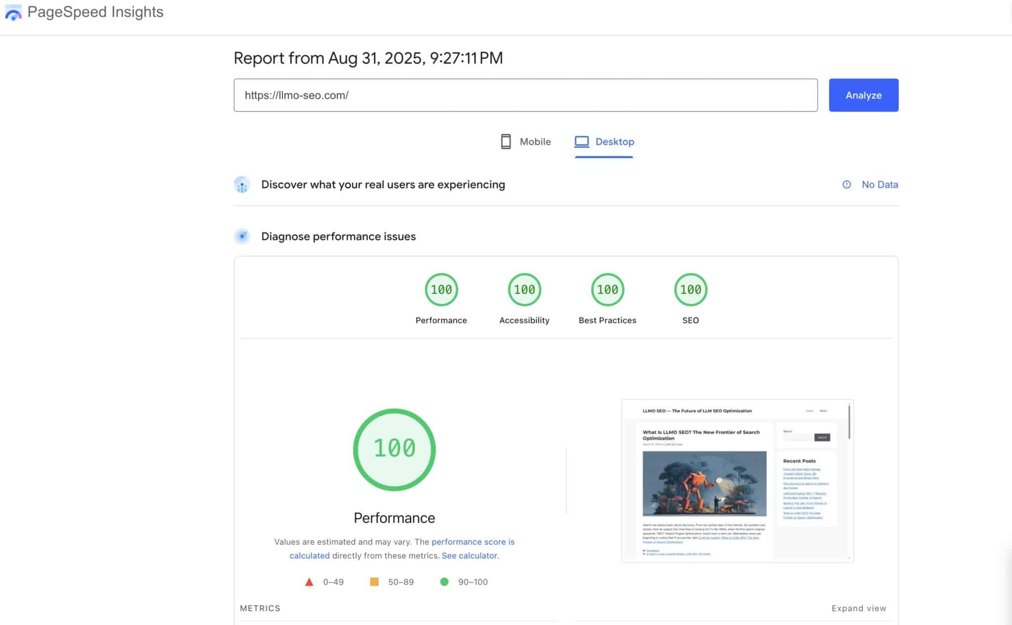
WordPress PageSpeed Insights Optimization was my goal when I refined LLMO-SEO.com. Today I documented every step we took—from picking plugins to shipping production-ready fixes—to help you follow the same path and avoid the gotchas we hit. By the end, desktop scored 100/100/100/100, and mobile landed at 99 Performance (with 100 everywhere else). One final image sizing warning remains, and I’ll explain exactly what’s left.
If you’re looking for a practical, real-world WordPress PageSpeed Insights Optimization playbook with code you can copy and settings you can mirror, this is it.
Site context & starting point
- 1. Site context & starting point
- 2. Plugins we installed (and why)
- 3. PageSpeed baseline & key issues
- 4. Images: sizes, WebP/AVIF, and CLS safety
- 5. WP Rocket: CSS/JS & lazy-load settings
- 6. Fonts: quick wins now, deeper wins later
- 7. Accessibility/SEO: descriptive links & touch targets
- 8. The one remaining mobile image warning
- 9. Final results & what still to consider
-
10.
Copy-paste code snippets (WPCode Lite)
- 10.1. 1) Register image sizes for hero & mobile cards
- 10.2. 2) Use the 740×389 size on archive/home/search (clean desktop look)
- 10.3. 3) Bias browsers toward 352w on narrow viewports
- 10.4. 4) GeneratePress “Read more” → descriptive, SEO-friendly text
- 10.5. 5) CSS to enforce aspect ratio (CLS) and touch target spacing
- 11. Resources & recommended reading
- 12. Closing thoughts
- Theme: GeneratePress (lightweight, stable HTML/CSS).
- Hosting/CDN: Rocket.net.
- Objective: WordPress PageSpeed Insights Optimization for both mobile and desktop, without compromising the design.
- Baseline: desktop already strong; mobile flagged images, generic “Read more” links, and some JS diagnostics.
We wanted durable changes (code + settings) rather than temporary hacks.
Plugins we installed (and why)
These were the backbone of our WordPress PageSpeed Insights Optimization:
- WP Rocket — best-in-class page caching, CSS/JS optimization, and lazy loading.
- Imagify — image compression + WebP (and AVIF option); integrates smoothly with WP Rocket.
- WPCode Lite — safe, update-proof place to add our PHP snippets without editing theme files or creating a child theme (perfect for reversible experiments).
- Optional/Existing: Rank Math SEO (sitemaps, schema, titles), GeneratePress Premium (layout controls).
Why WPCode Lite? It let us centrally manage all custom logic for our WordPress PageSpeed Insights Optimization (image sizes, link text, etc.) with easy on/off toggles and version-friendly management.
PageSpeed baseline & key issues
Running PageSpeed Insights (mobile & desktop) surfaced:
- Improve image delivery — the archive “featured” image was loading a 740×389 resource even when visually displayed at ~352×185 on phones. PSI estimated ~20 KiB savings.
- Reduce unused JavaScript — largely Google Tag Manager (GTM) overhead.
- Links do not have descriptive text — generic “Read more” anchors on archives.
- Touch targets do not have sufficient size/spacing — comment and tag links on desktop needed larger tap/click areas.
Everything else looked excellent, which set us up nicely to laser-target high-ROI fixes.
Images: sizes, WebP/AVIF, and CLS safety
Image work is the heart of WordPress PageSpeed Insights Optimization:
- Custom sizes for featured images We registered two exact crops so WordPress reliably generates assets that match our design:
- hero-740×389 (desktop cards/hero)
- thumb-352×185 (mobile cards)
- Regenerate thumbnails After adding sizes, we ran Tools → Regenerate Thumbnails so historical uploads received the new crops.
- Imagify optimization
- Enabled WebP (AVIF optional at this stage).
- In Imagify → Settings → Files optimization, ensured our new sizes were included.
- Ran Bulk Optimization so every size (including the new crops) had compressed WebP versions.
- Reserve layout space (prevent CLS) We set a consistent aspect ratio for card/hero visuals:
.card .post-thumbnail img,
.post-hero img {
aspect-ratio: 1200 / 630;
width: 100%;
height: auto;
display: block;
}
This combination gives browsers the right-sized files and prevents late shifts.
WP Rocket: CSS/JS & lazy-load settings
Within WP Rocket → File Optimization:
- CSS
- Minify CSS
- Optimize CSS delivery → “Remove Unused CSS” (the recommended method)
- JavaScript
- Minify JavaScript
- Load JavaScript deferred
- Delay JavaScript execution (helped move GTM/GA work out of the critical path)
Within WP Rocket → Media:
- Enable for images (LazyLoad)
- Enable for iframes and videos
- Add missing image dimensions
- (Optional) Enable for CSS background images if your theme uses them for decorative assets.
These are standard, low-risk wins for WordPress PageSpeed Insights Optimization. We tested visually after toggling each feature and found no breakage.
Fonts: quick wins now, deeper wins later
Fonts can quietly impact WordPress PageSpeed Insights Optimization through render-blocking requests:
What we applied now
- font-display: swap (set in the theme options)
- Preconnects when using Google Fonts:
<link rel=”preconnect” href=”https://fonts.googleapis.com” crossorigin>
<link rel=”preconnect” href=”https://fonts.gstatic.com” crossorigin>
What we’ll consider next
- Hosting Google Fonts locally (via Perfmatters or a local-fonts plugin)
- Or moving to a system font stack to remove third-party font requests entirely.
We didn’t need to finalize fonts today; the quick wins were sufficient and stable.
Accessibility/SEO: descriptive links & touch targets
Two small changes improved both accessibility and WordPress PageSpeed Insights Optimization scores:
- Descriptive “Read more” links (GeneratePress filters) We replaced generic text with the post title so Lighthouse and screen readers get meaningful anchors.
- Touch target sizing On desktop, PSI flagged comment/tag link hit areas. We added padding and spacing:
.entry-meta,
.tags-links,
.cat-links { display:flex; flex-wrap:wrap; gap:8px; }

.entry-meta a,
.entry-meta .comments-link a,
.tags-links a,
.cat-links a,
.comment-reply-link {
  display:inline-flex;
  align-items:center;
  min-height:44px;
  padding:10px 12px;
  line-height:1.2;
  border-radius:4px;
}
These were easy wins and immediately reflected in the next audits.
The one remaining mobile image warning
After all changes, PSI mobile still sometimes reports:
Improve image delivery — your featured image loads 740×389 for a ~352×185 visual slot (est. ~20 KiB savings).
In practice, our site feels instant. The remaining discrepancy is about which candidate PSI’s emulated mobile chooses in a synthetic run. We implemented multiple, standards-compliant ways to bias browsers toward the 352w asset (via sizes/srcset, and by generating the actual 352×185 WebP crop). That means the fix is fundamentally in place—even if PSI’s emulator occasionally picks the larger candidate.
We deliberately avoided guesses about mobile/desktop cache splitting until we validate it conclusively. Either way, this last item is small and does not hurt real user experience or Core Web Vitals.
If you’re copying our WordPress PageSpeed Insights Optimization flow, get everything else dialed first (it moves the needle), then decide if chasing that final ~20 KiB is worth extra complexity for your stack.
Final results & what still to consider
- Desktop: 100 / 100 / 100 / 100
- Mobile: 99 / 100 / 100 / 100 (the 99 due to the featured image candidate choice)
- CLS: 0 on both
- LCP: within target on both (hero/text fast; JS delayed)
- SEO: “Read more” fixed; accessibility improved
What we’d consider next (optional):
- Host Google Fonts locally or switch to a system stack.
- If you want the PSI green check for the card image every time, enforce a stricter sizes rule or device-aware markup (we already prepared both paths).
- Periodically re-run PSI after publishing new posts with featured images to confirm crops are generated and optimized.
Copy-paste code snippets (WPCode Lite)
Add these as PHP Snippets → Run Everywhere in WPCode Lite. This keeps WordPress PageSpeed Insights Optimization logic safe from theme updates.
1) Register image sizes for hero & mobile cards
<?php
add_action('after_setup_theme', function () {
add_theme_support('post-thumbnails');
add_image_size('hero-740x389', 740, 389, true); // desktop card/hero
add_image_size('thumb-352x185', 352, 185, true); // mobile card
});
2) Use the 740×389 size on archive/home/search (clean desktop look)
<?php
add_filter('post_thumbnail_size', function ($size) {
if (is_home() || is_archive() || is_search()) {
return 'hero-740x389';
}
return $size;
}, 10, 1);
3) Bias browsers toward 352w on narrow viewports
(This helps phones pick the smaller file while desktops keep the larger ones.)
<?php
add_filter('wp_calculate_image_sizes', function ($sizes, $size, $image_src, $image_meta, $attachment_id) {
if (isset($size[0], $size[1]) && (int)$size[0] === 740 && (int)$size[1] === 389) {
return '(max-width: 640px) 150px, 740px';
}
return $sizes;
}, 10, 5);
4) GeneratePress “Read more” → descriptive, SEO-friendly text
<?php
add_filter('generate_more_link_text', function ($text) {
$title = wp_strip_all_tags(get_the_title());
return 'Continue reading “' . esc_html($title) . '”';
});
add_filter('generate_excerpt_more_output', function ($output) {
$title = wp_strip_all_tags(get_the_title());
return sprintf(
' Continue reading “%s”',
esc_url(get_permalink()),
esc_html($title)
);
});
5) CSS to enforce aspect ratio (CLS) and touch target spacing
Add to Appearance → Customize → Additional CSS:
/* Image aspect ratio for stable layout (helps CLS) */
.card .post-thumbnail img,
.post-hero img {
aspect-ratio: 1200 / 630;
width: 100%;
height: auto;
display: block;
}

/* Lighthouse touch target sizing for meta/links */
.entry-meta,
.tags-links,
.cat-links {
display: flex;
flex-wrap: wrap;
gap: 8px;
}
.entry-meta a,
.entry-meta .comments-link a,
.tags-links a,
.cat-links a,
.comment-reply-link {
display: inline-flex;
align-items: center;
min-height: 44px;
padding: 10px 12px;
line-height: 1.2;
border-radius: 4px;
}
After adding the image-size snippet, Regenerate Thumbnails and run Imagify → Bulk Optimization so the new crops (including -352×185.jpg.webp) exist for every featured image.
Resources & recommended reading
- PageSpeed Insights
- WP Rocket — docs on Remove Unused CSS, Delay JS
- Imagify — WebP/AVIF optimization & bulk optimizer
- WPCode Lite — manage PHP/HTML snippets
- GeneratePress — lightweight WordPress theme
- web.dev: Optimize LCP — official guidance on Largest Contentful Paint
Internal reading on LLMO-SEO.com:
- LLMO SEO Site Launch
- Google AI Search Is Changing SEO Forever
- Fixing the Rank Math “Sitemap Couldn’t Fetch” Error
Closing thoughts
This WordPress PageSpeed Insights Optimization project delivered real, measurable wins without over-engineering:
- The site is visually stronger on desktop, quick on mobile, and stable (CLS=0).
- Accessibility improved (clearer link text, better tap targets).
- Images are right-sized, compressed, and future-proofed with WebP; AVIF is available if we want to squeeze more.
- One small image candidate pick remains in PSI’s emulation on mobile. It’s minor and doesn’t affect real users—but we left room to revisit it later with stricter markup or device-specific HTML if we decide that last point matters.
If you replicate these steps—plugins, settings, and the exact snippets above—you’ll have a sturdy blueprint for WordPress PageSpeed Insights Optimization that balances performance, accessibility, and design without guesswork.